10 Best Colors for Autumn Themed Wall Decor
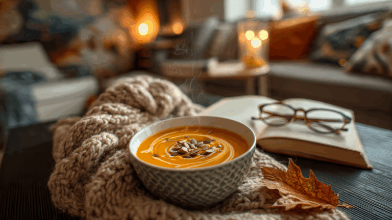
As soon as the air gets a little crisper, I get the undeniable urge to fill my home with the cozy warmth of fall. Swapping out my wall decor is one of the easiest ways to welcome the season, and it all starts with choosing the perfect color palette. But which shades truly capture the essence of autumn?Autumn wall decore
From the classic reds and oranges of falling leaves to sophisticated, earthy neutrals, the best colors for autumn themed wall decor can completely transform your space. In my experience as a home decor enthusiast, the right hues can make your home feel like a warm, inviting sanctuary all season long. Let’s dive into the top colors that will bring that perfect fall feeling to your walls.
Key Takeaways: Quick Guide to Autumn Colors
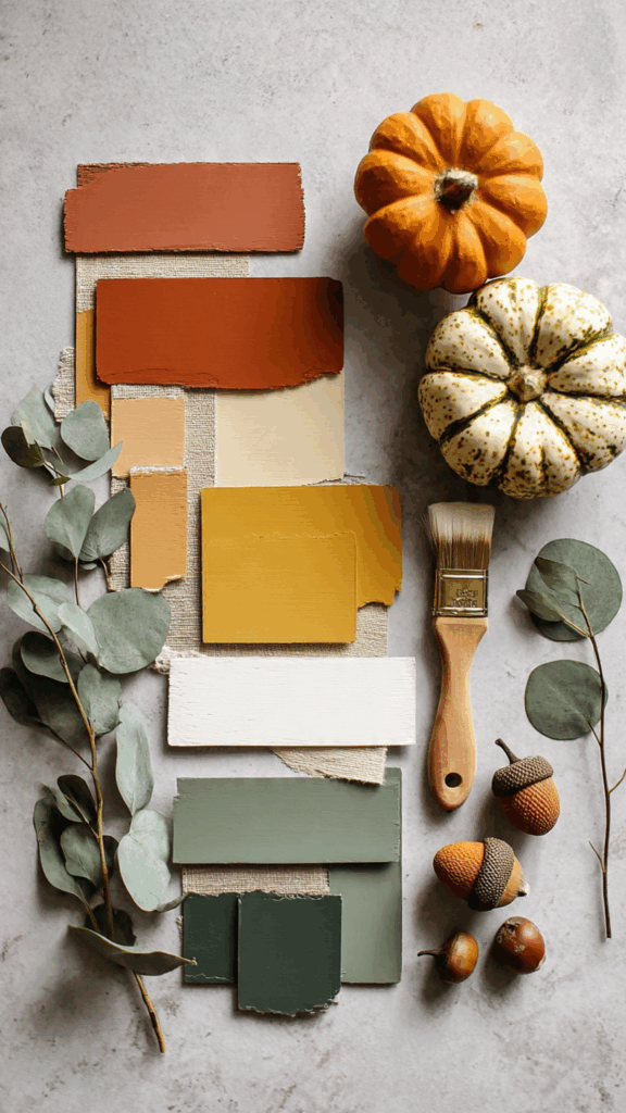
- Embrace the Classics: You can’t go wrong with traditional autumn colors like burnt orange, deep red, and mustard yellow for a timeless, cozy feel.
- Think Beyond Orange: Modern autumn palettes include earthy tones like terracotta, moss green, and warm beige for a more subtle, sophisticated look.
- Use Accent Colors Wisely: Pops of cream, gold, or even a deep navy can elevate your fall decor and add visual interest.
- Texture is Key: Combine your color choices with different textures (like wood, wool, or metal) to add depth and warmth to your wall displays.
The Classic Autumn Color Palette: Timeless & Cozy
When you think of fall, a few iconic colors probably come to mind. These shades are classics for a reason—they instantly evoke feelings of warmth, comfort, and nostalgia. What I’ve found works best is using these as your foundational colors for any fall wall decor project.
1. Burnt Orange
This is the quintessential autumn color. It’s warm, inviting, and reminiscent of pumpkin patches and changing leaves. A burnt orange accent wall or a large piece of abstract art in this shade can become the stunning focal point of any room.
2. Mustard Yellow
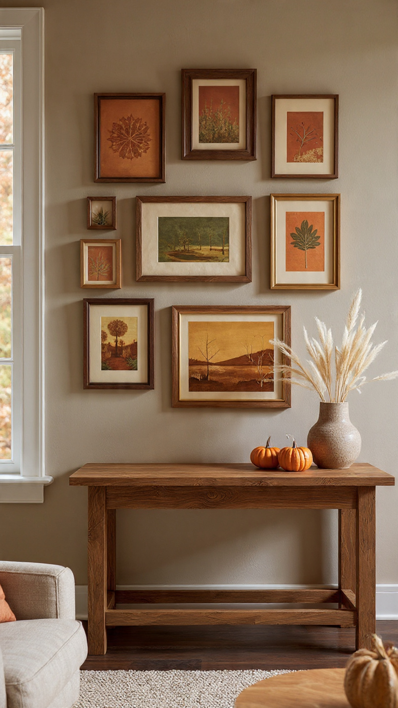
Brighter than traditional gold, mustard yellow brings a cheerful yet sophisticated energy. It pairs beautifully with deeper tones like navy blue or charcoal gray. Consider a gallery wall featuring prints with pops of mustard yellow for a vibrant, modern touch.
3. Deep Red & Burgundy
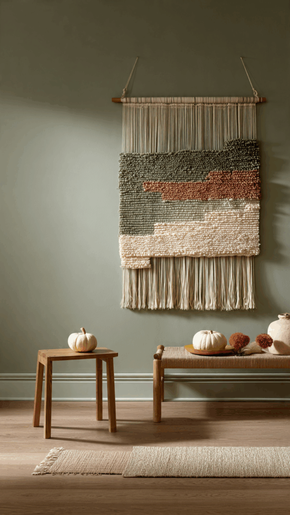
Think of the rich color of cranberries or a glass of red wine. Deep reds and burgundies add a layer of elegance and passion to your decor. These colors work especially well in spaces meant for relaxation, like the living room or bedroom. For a pro tip, try hanging a woven tapestry that blends these rich red tones.
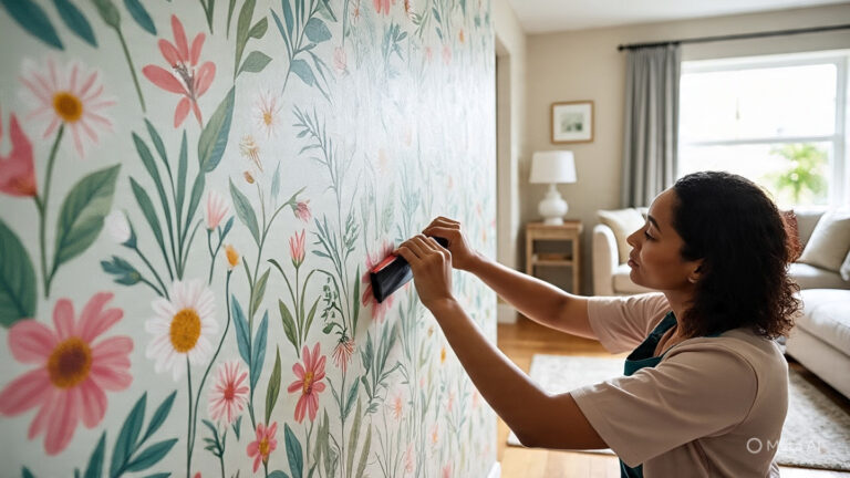
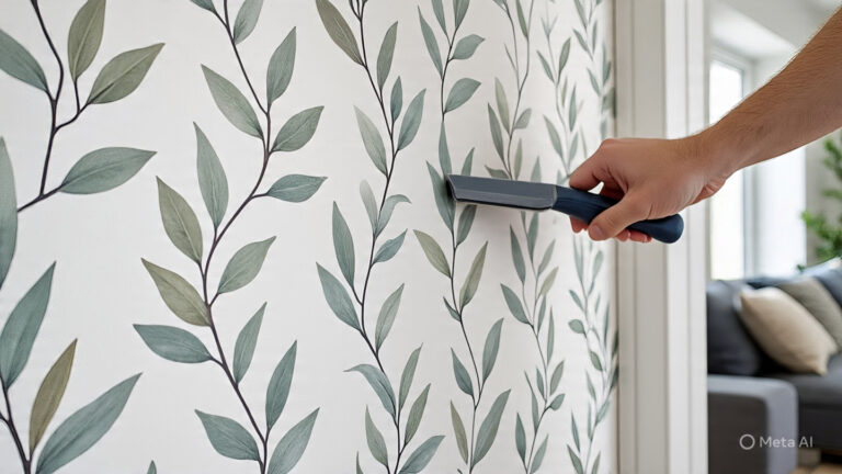
Earthy & Neutral Tones: A Modern Take on Fall
If the traditional brights aren’t your style, an earthy and neutral palette can create a serene, modern autumn vibe. These colors are inspired by nature and offer a more understated way to celebrate the season. This approach is perfect for a minimalist or Scandinavian-inspired home.
4. Terracotta
This earthy, clay-inspired hue has been a designer favorite for years, and it’s perfect for fall. It’s a grounded, warm color that feels both ancient and incredibly modern. Terracotta-colored wall hangings or ceramic plates can add incredible texture and warmth.
For more ideas on how to incorporate subtle seasonal touches, check out our guide on [Link to: Boho Autumn Wall Decor with Neutral Tones].
5. Moss Green
While green might make you think of spring, the deep, muted tones of moss green are perfect for grounding an autumn color scheme. It reflects the everlasting nature of pine trees as other leaves fall. In my experience, pairing moss green with warm woods and creamy whites creates a calming, natural atmosphere.
6. Warm Beige & Cream
Never underestimate the power of a good neutral! Warm beiges, oatmeals, and creamy whites provide a perfect backdrop for other autumn colors to shine. They create a soft, cozy canvas and prevent your decor from feeling too dark or heavy. Consider layering frames or shelves in these tones for a subtle nod to the season.
Unexpected Accent Colors to Elevate Your Autumn Decor
Ready to try something a little different? Adding an unexpected accent color can make your autumn wall decor feel unique and personalized. A little splash of a contrasting or complementary color can make all the difference.
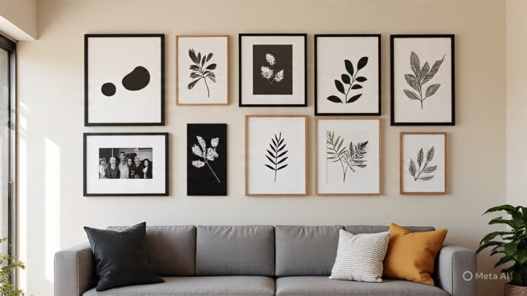
7. Slate Gray
A cool, moody gray can provide a stunning contrast to the warmth of traditional fall colors. It adds a touch of modern sophistication. Imagine a gallery wall of black-and-white photos mixed with a few prints featuring burnt orange or mustard yellow against a slate gray wall—gorgeous!
8. Deep Navy
Rich, dramatic, and incredibly chic. Deep navy is a fantastic partner for autumn hues, especially mustard yellow and copper. It makes warm colors pop and creates a sense of cozy intimacy. A single piece of navy wall art can be a powerful statement.
9. Plum
For a touch of luxury, consider deep plum. This jewel tone is a beautiful, less-expected alternative to burgundy. It pairs wonderfully with gold or brass accents, adding a hint of glamour to your fall setup.
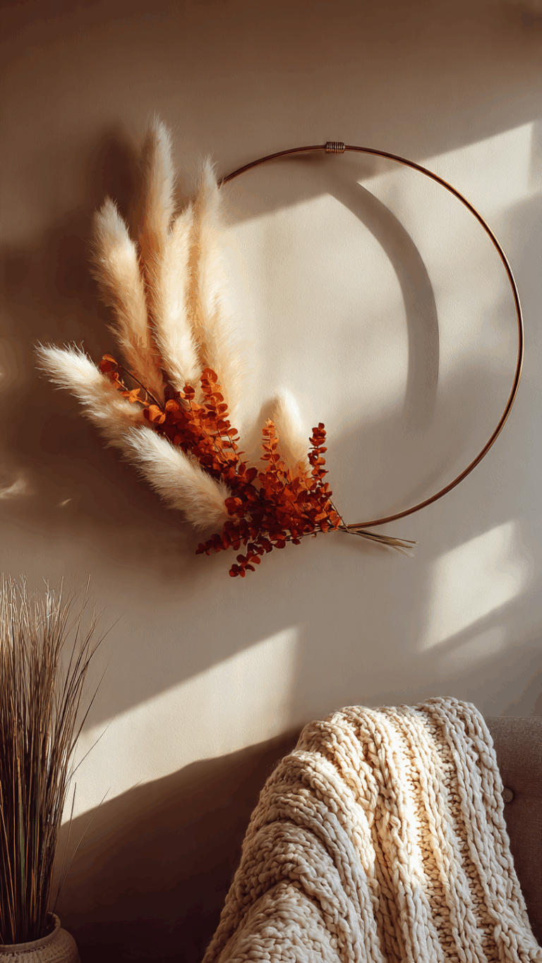
10. Metallic Gold or Copper
A little bit of shine goes a long way! Metallic accents in gold, brass, or copper can catch the light beautifully, mimicking the golden glow of an autumn sunset. You can incorporate this with metallic frames, a delicate wire wall sculpture, or even a garland with gold-painted leaves.
Speaking of budget-friendly ideas, you can find many great tips in our article on [Link to: How to Decorate Your Walls for Autumn on a Budget].
Frequently Asked Questions (FAQ)
Q1: How can I incorporate autumn colors without painting my walls? You don’t need to paint! The easiest way is through wall art, textiles like tapestries or wall hangings, decorative plates, or seasonal wreaths. Even swapping out the photos in your existing frames for ones with an autumnal color scheme can make a big impact.
Q2: Can I mix warm and cool autumn colors? Absolutely! In fact, it often creates a more balanced and visually interesting look. For example, pairing warm burnt orange and mustard yellow with a cool slate gray or deep navy creates a sophisticated, modern palette. The key is to choose one temperature as your dominant theme and use the other for accents.
Q3: What are the best autumn wall decor colors for a small room? For smaller rooms, it’s best to stick with lighter, brighter autumn colors as your base to keep the space from feeling cramped. Use warm beige, cream, or a soft mustard yellow as your main color. Then, bring in deeper shades like burgundy or moss green in smaller doses through art prints or a small wreath.
Q4: How do I transition my autumn wall decor into winter? Choose a base palette that can easily transition. Earthy tones like moss green, slate gray, and cream work well for both seasons. As winter approaches, you can swap out the burnt orange elements for deep reds, silver accents, or frosty blues while keeping the neutral pieces in place.
Ready to Color Your Walls with Autumn?
Choosing the right colors is the first step to creating a home that feels like a cozy autumn retreat. Whether you lean towards the timeless warmth of burnt orange and deep red or prefer a modern, earthy palette of terracotta and moss green, there’s a perfect fall combination waiting for you.
Don’t be afraid to experiment and mix and match to find what you love. I hope this guide has inspired you to bring the beauty of the season to your walls!